Python Plotting Recipes
Python has some excellent plotting packages. This post looks at creating static plots for publication or various other uses. I use two main packages for my plotting.
-
Matplotlib - Documentation - This is the main plotting package for python. It is capable of producing publication quality plots and can do just about everything you can imagine. It has a rich history in the python world.
-
Seaborn - Documentation - Seaborn is what makes your plots pretty. It is extremely easy to use and you can almost just set it and forget it.
If you are reading this, I assume you have seen the default matplotlib format–I do not find it particularly pleasing to the eye. To combat this, after my usual imports of matplotlib, numpy and whatever packages I need for a particular task, I import Seaborn and set it as the default style for my ipython notebook or any other plots I will save. This is simply done as:
1
2
3
4
import seaborn as sns

sns.set_style('ticks')
sns.set_context('notebook',font_scale=1.5)
In lines 1 and 2 above, I import seaborn and then set it as my default plotting style. This is all it takes to make more visually appealing plots. In lines 4 and 5, I set some more parameters that I like particularly. Line 4 changes the default seaborn style to ticks. There are actually four styles that can be set depending on preference:
- darkgrid
- whitegrid
- dark
- white
- ticks
I usually prefer ‘ticks’. Line 5 sets the context with ‘notebook’ being the defualt. There are four different contexts that can be set:
- paper
- notebook
- talk
- poster
Also in line 5, I set the font_scale to 1.5. This increases the font on axes and titles. I find the default to be a little small. The following will show some of my favorite recipes.
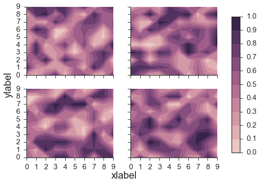
Subplots with Colorbar
1
2
3
4
5
6
7
8
9
10
11
12
13
14
15
16
17
18
19
20
21
22
cmap = sns.cubehelix_palette(8, as_cmap=True)
fig, axes = plt.subplots(nrows=2, ncols=2,sharex=True,sharey=True)
v = np.linspace(0,1,11)

for ax in axes.flat:
    X = np.random.random((10,10))
    im = ax.contourf(X,v,cmap=cmap, vmin=0, vmax=1)

#despine
sns.despine()

# Axis labels
fig.text(0.45, 0.03, 'xlabel', ha='center', va='center',size=20)
fig.text(0.06, 0.5, 'ylabel', ha='center', va='center',
	rotation='vertical',size=20)

# shift them around a little to accomadate a colorbar
fig.subplots_adjust(right=0.8,hspace=0.2, wspace=0.2)

# add Colorbar
cbar_ax = fig.add_axes([0.85, 0.15, 0.03, 0.7])
fig.colorbar(im, cax=cbar_ax,ticks=v);
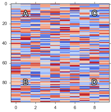
Adding Text
1
2
3
4
5
6
7
8
9
10
11
12
13
14
15
16
17
import matplotlib.patheffects as path_effects

cmap='coolwarm'

fig, ax = plt.subplots(figsize=(6,6))

z=np.random.rand(100,10)
im = ax.imshow(z,interpolation = 'none',cmap = cmap, aspect='auto')

letters = ['A','B','C','D']
x_pos = [1,1,8,8]
y_pos = [10,80,10,80]
for ii in range(len(letters)):
    text =  ax.text(x_pos[ii], y_pos[ii], letters[ii],
    	ha='center',va='center',size=25, color='white')
    text.set_path_effects([path_effects.Stroke(linewidth=4,
    	foreground='black'),path_effects.Normal()])
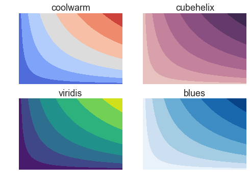
Colormaps
1
2
3
4
5
6
7
8
9
10
11
12
13
14
cmaps = ['coolwarm',
        sns.cubehelix_palette(8, as_cmap=True),
        'viridis',
        'Blues']
fig_titles = ['coolwarm','cubehelix','viridis','blues']

fig,axes = plt.subplots(nrows=2, ncols=2)
ax = axes.ravel()
xx,yy = np.meshgrid(np.linspace(0,10),np.linspace(0,10))
for ii in range(4):
    ax[ii].contourf(xx**.5*yy**.5,cmap=cmaps[ii])
    ax[ii].axis('off');
    ax[ii].set_title(fig_titles[ii])
fig.savefig('plotting_figures/colormaps.png',bbox_inches='tight')
Legends
1
2
3
4
5
6
7
8
9
10
11
12
13
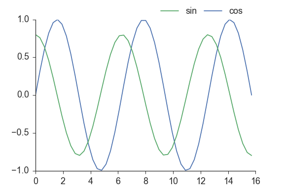
x = np.linspace(0,5*np.pi)
y1 = np.sin(x)
y2 = .8*np.cos(x)
fig,ax = plt.subplots()
ax.plot(x,y1,label='cos')
ax.plot(x,y2,label='sin')
handles, labels = ax.get_legend_handles_labels()
ax.legend(handles,labels,bbox_to_anchor=(.75,1), loc=3,
ncol=2, mode="expand", borderaxespad=0.)
sns.despine()
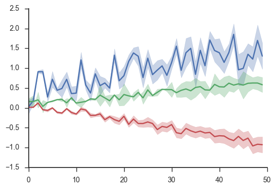
Errors
1
2
3
4
5
6
7
8
9
10
11
12
13
14
15
16
17
18
19
20
21
22
x = np.arange(50)
y1 = np.random.rand(50) + np.linspace(0,1,50)
y2 = .2*np.random.rand(50) + .5*np.linspace(0,1,50)
y3 = .2*np.random.rand(50) - np.linspace(0,1,50)


y1_error = .2*np.random.rand(50) ++ np.linspace(0,.25,50)
y2_error = .1*np.random.randn(50) + np.linspace(0,.2,50)
y3_error = .01*np.random.randn(50) + np.linspace(0,.2,50)


fig,ax = plt.subplots()

line_c, = ax.plot(x,y1)
ax.fill_between(x,y1-y1_error, y1+y1_error,color=line_c.get_color(),alpha=.3)

line_c, = ax.plot(x,y2)
ax.fill_between(x, y2-y2_error, y2+y2_error, color=line_c.get_color(), alpha=.3)

line_c, = ax.plot(x,y3)
ax.fill_between(x, y3-y3_error, y3+y3_error, color=line_c.get_color(), alpha=.3)
sns.despine()