Kaggle March Machine Learning Madness
Starting in 2013, Kaggle has held a competition called March Machine Learning Madness every year. The goal of the competition is to correctly predict the outcome of the NCAA Tournament. Competitors are free to use outside sources of data, but Kaggle provides data to the participants. I decided to only use the data provided by Kaggle in order to hone my Pandas skills. The two most important data files that Kaggle provided were:
1. RegularSeasonDetailedResults.csv
2. TourneyDetailedResults.csv
The first file has game by game statistics for the regular season games from 2003-2015. The second file has the game by game statistics for the tournament games from 2003-2015. Both files have the statistics listed below.
- Points scored in a game (score)
- Field goals made (fgm)
- Field goals attempted (fga)
- Three-pointers made (fgm3)
- Three-pointers attempted (fga3)
- Free throws made (ftm)
- Free throws attempted (fta)
- Offensive rebounds (or)
- Defensive rebounds (dr)
- Assists (ast)
- Turnovers (to)
- Steals (stl)
- Blocks (blk)
- Personal fouls (pf)
In addition to these statistics, I calculated some additional stats in accordance with the paper, Predicting college basketball match outcomes using machine learning techniques: some results and lessons learned. The intent of this paper is to normalize each of the statistics by the number of possessions a team has per game. The additional seven statistics are:
- Number of possessions (poss)
- Offensive efficiency (oe)
- Defensive efficiency (de)
- Effective field goal percentage (efg)
- Turnover percentage (eto)
- Offensive rebound percentage (eor)
- Free throw rate (eftr)
Now that all the stats have been calculated on a game by game basis, the next step is to calculate a team’s stats through the season. This is done so that I have a good idea of a team’s abilities at the end of a season which is important for constructing a model to predict the outcome of the tournament. More concretely, data comes in the form:
| ID(T1) | ID(T2) | S1(T1) | S2(T1) | S1(T2) | S2(T2) | |
|---|---|---|---|---|---|---|
| Game 1 | 3 | 9 | 1 | 4 | 3 | 4 |
| Game 2 | 3 | 5 | 10 | 6 | 3 | 6 |
| Game 3 | 2 | 4 | 1 | 9 | 3 | 9 |
Where ID(T1) is the team ID of team 1 and S2(T1) is stat 2 for team one. Therefore, I needed to transform the data from game by game to daily. For each stat, a separate DataFrame is created. For example, the DataFrame for points scored in a game might look like:
| T1 | T2 | T3 | T4 | T5 | |
|---|---|---|---|---|---|
| Day 1 | 66 | 79 | 51 | 84 | NaN |
| Day 2 | 73 | 75 | 80 | 66 | 84 |
| Day 3 | 72 | 84 | 61 | 89 | 74 |
In the table above, Team 5 did not have a game on day 1. Next a running average of a teams statistics through the season is calculated. In conjunction with the daily statistics, a teams Rating Percentage Index (RPI) was also calculated. RPI is a combination of a team’s winning percentage, its opponents’ winning percentage, and the winning percentage of those opponents’ opponents. We calculate each independently adding an additional four statistics.
- Winning percentage (wp)
- Winning percentage of opponents (wpo)
- Winning percentage of the opponents’ opponents (wpoo)
- Rating percentage index (rpi)
To get the end of the season stats, we grab the last row of each of the DataFrames. This creates another DataFrame that looks like:
| S1 | S2 | S3 | S4 | S5 | |
|---|---|---|---|---|---|
| Team 1 | 6.1 | 7.9 | 5.1 | 84.3 | 88.2 |
| Team 2 | 6.9 | 5.9 | 5.9 | 74.2 | 67.3 |
| Team 3 | 6.2 | 7.8 | 6.1 | 73.2 | 87.1 |
Now that we have the stats for each team, we can easily populate a matrix that we can use to train a model to predict the outcome of the tournament. Given a list of tournament games, the training matrix will take the form of:
| S1(T1) | S2(T1) | S1(T2) | S2(T2) | T1 Win | |
|---|---|---|---|---|---|
| Game 1 | 3.1 | 9.2 | 1.6 | 4.7 | 1 |
| Game 2 | 3.2 | 5.1 | 10.4 | 6.9 | 0 |
| Game 3 | 2.1 | 4.2 | 1.2 | 9.9 | 1 |
In order to fill in our data more completely, we used both both permutations of a game. For example, if Kansas was team 1 and Maryland was team 2, I flipped the data so that Maryland was team 1 and Kansas was team 2. This effectively creates two data points from one data point. As an example, lets look at scatter plot of RPI for the 2003-2011 tournaments.
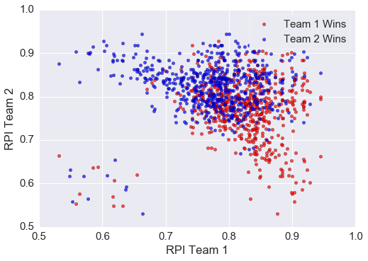
As is evident from the image, RPI does a relatively decent job of separating the winning and losing teams. Teams with higher RPI tend to do well against teams with a lower RPI as expected. The boundary, however, between teams with a similar RPI is quite fuzzy. In order to classify the winner and losers, I opted for a logistic regression. Implementing this in python takes only a few lines of code and produces relatively good results. The python code is:
1
2
3
4
5
6
7
8
9
10
11
12
13
14
15
from sklearn.cross_validation import train_test_split
from sklearn import linear_model

X_train, X_test, y_train, y_test = train_test_split(F, T,
    test_size=0.33,random_state=None)

# create the regression object
logregr = linear_model.LogisticRegression()

# train the model
logregr.fit(X_train, y_train)

preds = logregr.predict(X_test)
logregr.score(X_test,y_test)
logregr.predict_proba(X_test)[:,1]
On line 1 we import train_test_split which is a convenient one-liner for splitting the data into a testing set and a training set. Line 2 imports linear_model which houses the logistic regression. Lines 4-5 actually split the data into our training sets and our testing set. F is the features and T is the targets. Line 8 creates our logistic regression object. Line 11 fits the logistic regression. Line 13 retrieves the predictions for our testing set. Line 14 calculates what percent were correctly classified. Finally line 15 gives the probability of team 1 winning for each of our test points.
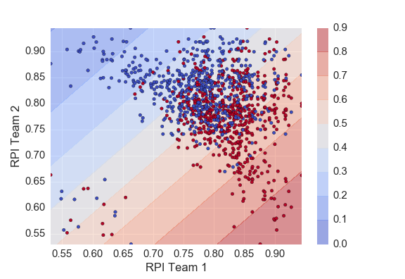
The plot below shows the probability contours given by our logistic regression. As expected we see the highest probability of team 1 winning when team 1 plays a team with a low RPI.
Next I wanted to use more than just RPI to predict the outcome of a certain game. I ended up using:
- Winning percentage
- Winning percentage of opponents (wpo)
- Winning percentage of the opponents’ opponents (wpoo)
- Offensive efficiency (oe)
- Defensive efficiency (de)
- Effective field goal percentage (efg)
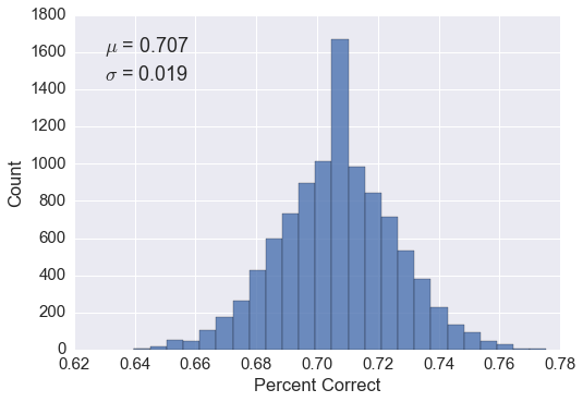
This yielded pretty decent results as seen in the figure below. I randomly split the feature and target matrix into a testing set and training set 10,000 times (overkill? yes). This gave me a good idea of what I should expect when I predict the 2012-2015 tournaments.
The kaggle competition, however, scores the algorithms using a log loss.
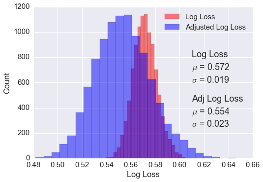
\[LogLoss = -\frac{1}{n} \sum_{i=1}^n [y_i log(\hat y_i) + (1-y_i) log(1-\hat y_i)],\]where \(n\) is the number of games played, \(\hat{y}_i\) is the predicted probability of team 1 beating team 2, and \(y_i\) is 1 if team 1 wins, 0 if team 2 wins. Using the same logistic regression, the distribution of log loss scores is shown below. The red shows the distribution as it comes out of the model. The blue is adjusted probabilities. In order to score a lower log loss score, the probabilities output by the model were slightly skewed. Probabilities lower than 0.35 were reduced by 0.05 and probabilities over 0.65 were increased by .05. This efficiently makes the algorithm a little more confident and results in a wider distribution of log loss scores, but also the mean log loss score is lower as seen in the figure below.
The only thing left to do for the first part of this competition is to predict the tournaments from 2012-2015. Submitting resulted in a log loss score of 0.561900. This was within one standard deviation of what was expected, so no surprises.
Part Two - Predicting the 2016 Season
The second part of the competition was to predict the outcome of the 2016 NCAA tournament. I ended up using the same model as above (logistic regression with skewed probabilities). We expected a log loss of around 0.554 as shown above. The model output the probabilities below for the tournament:
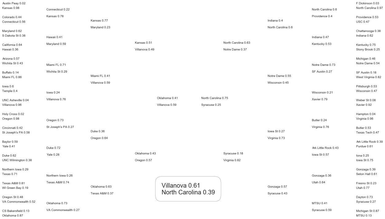
As is evident, there were a couple large upsets in round 1 (MTSU and Syracuse in particular). This hurt many peoples models in the competition.
In order to get an idea of where I stand on the leader board, I created a quick script to scrape the scores and plot them as a histogram. As shown in the figure below.
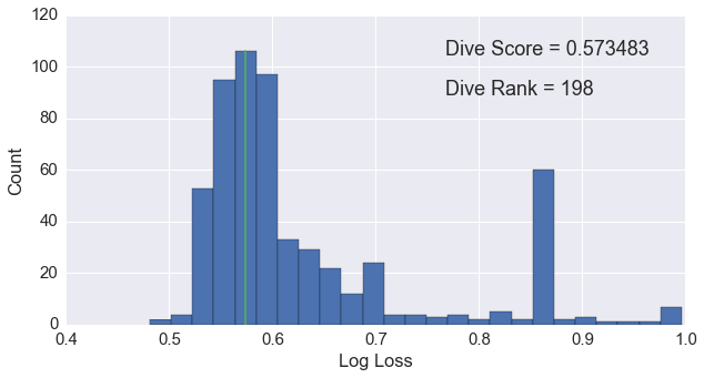
As we can see, the log loss scores follow roughly a normal distribution with fat, right tail and a mean around 0.55. My score, 0.573, is represented by the green line. The single, large peak at 0.85 is due to an over-fit model that was shared on the forums. On the training data, the model scored a logloss of 0.23. Many users apparently grabbed the model and fed 2016’s data into the algorithm. This obviously resulted in very poor performance.
Reflection
This tournament was a lot of fun and really helped improve my data manipulation skills. If kaggle decides to hold the tournament again next year, I will definitely participate. I wish I had more time to focus on making a more sophisticated model than just a logistic regression. While looking at past events, I saw that a competitor, Alex Skidanov, had used a player based model using neural networks. Next year I would like to create something similar.
It was great getting my feet wet in these Kaggle competitions.
You can find my code for this competition here.